Duration: October 2019
Role: Branding, Research, UI/UX Designer and Web Developer(Squarespace).
WHO IS FLITE?
Flite is a private equity firm that syndicates investment properties, where the team handles all the work to acquire and manage commercial real estate assets that allows our investors to remain passive while they collect double digit returns and appreciation with a protected and secured asset.
HOW CAN I HELP?
The challenge was creating a brand that is modern yet still speaks to investors. I combined the company's drive and energetic "startup" feel into one whole brand. I have to make something out of nothing; the logo, business card and website.
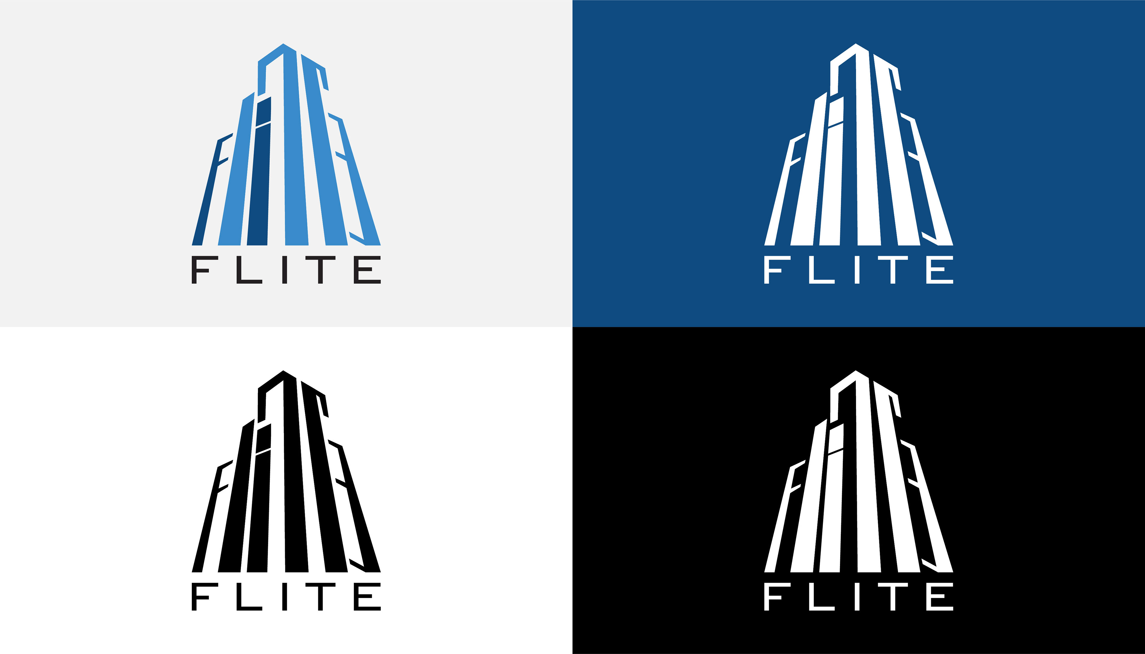
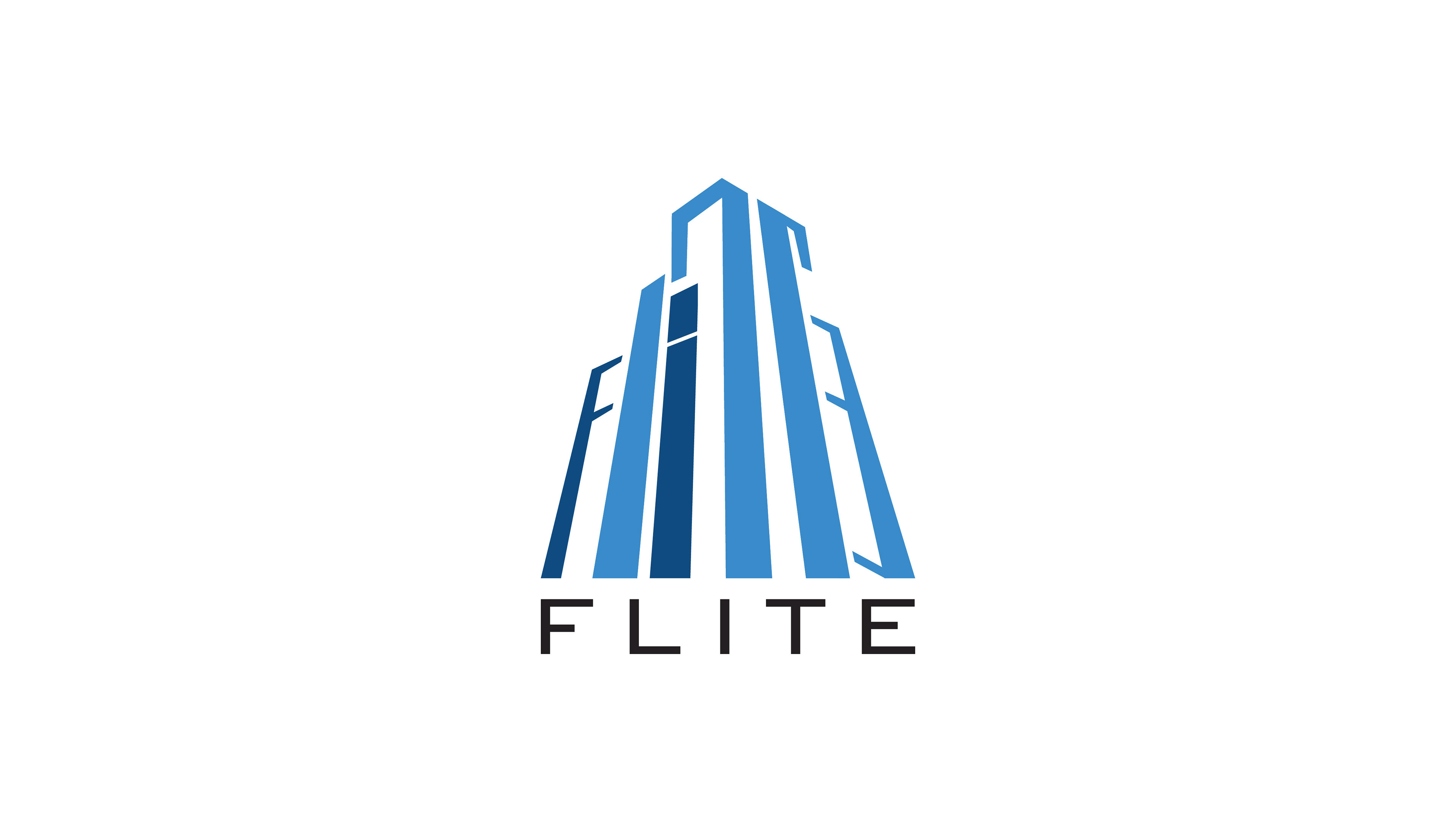
BRANDING
LOGO TYPOGRAPHY
As for typography, I chose the typeface Bank Gothic for its financial look to help the target audience recognize and easily connect with.
LOGO COLOR
I chose the shades of blue because the color blue is seen as a sign of stability and reliability. The color blue calls to the mind feelings of calmness and security, I used the color blue across the website to help balance all the content.


THE
SOLUTION
MY APPROACH
To assist the Flite team, I decided to design an informative website that's visually engaging yet still converts possible leads and investors. The goal was to present as much useful information as possible to educate the first time investors and influence the new. I wanted the user to feel that Flite cared about their legacy and provided enough info to gain the users trust.